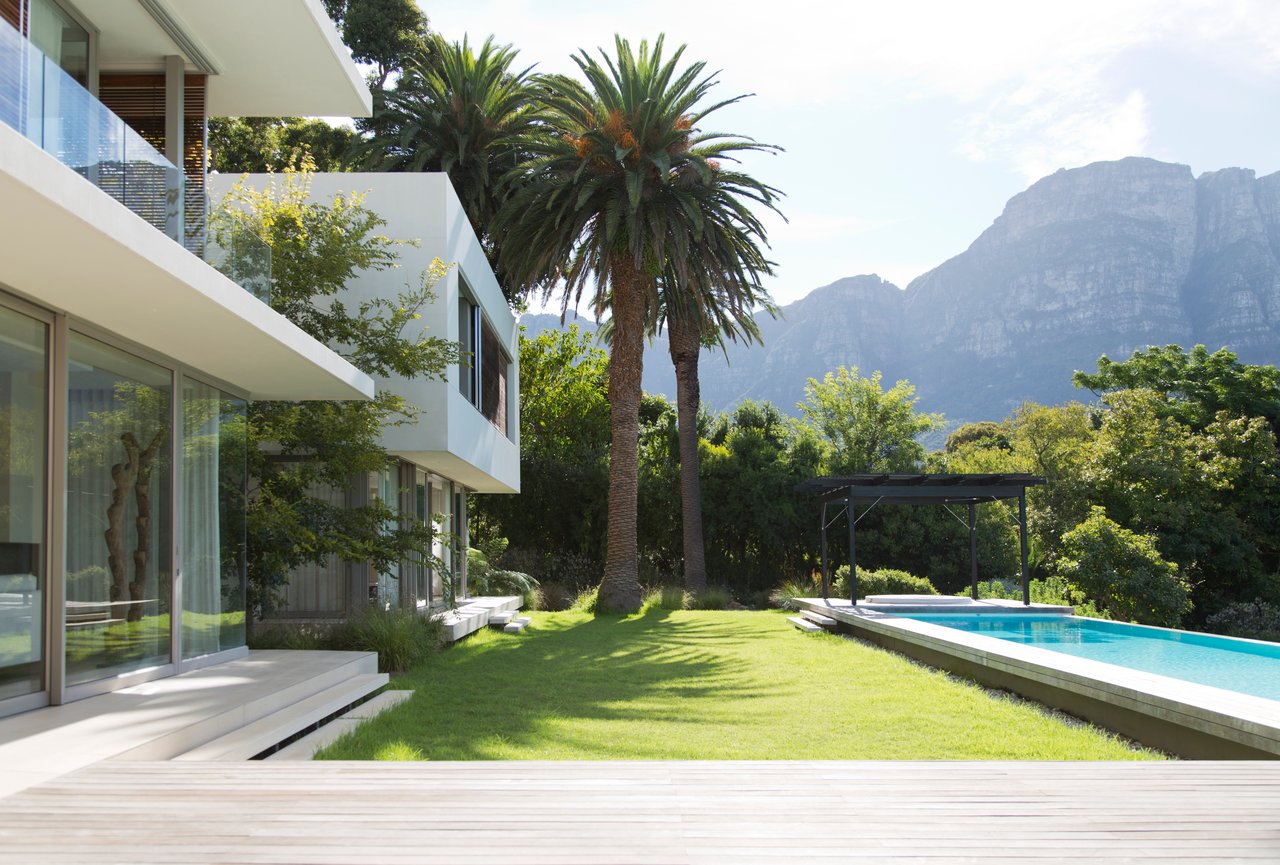
Color is more than just a design choice; it has the ability to transform the way you experience your home. The right paint tones can make a room feel larger, cozier, brighter, or calmer. When you choose wisely, color enhances architecture, complements furniture, and reflects your personality. So, with countless shades available, how do you decide which tones will truly work for your space?
The answer lies in understanding the science of color. Paint is not only visual; it interacts with light, psychology, and even the way your brain perceives depth. This guide explores the impact of color and provides practical steps to help you make decisions with confidence. By the end, you will know exactly how to approach your paint selections so every room in your home feels intentional and beautifully complete.
How Color Affects Mood And Energy
Color psychology plays a crucial role in how a room makes you feel. Warm tones like reds, oranges, and yellows tend to stimulate energy and conversation, making them popular in kitchens and dining areas. On the other hand, cooler tones, such as blues and greens, promote relaxation and focus, which is why they’re often chosen for bedrooms, offices, or bathrooms.
Neutrals deserve special attention because they offer balance. Shades of gray, beige, and white create a versatile foundation that pairs well with both warm and cool accents. They are also timeless, which helps if you want your home to feel modern without being tied to fleeting trends.
The key is to think about how you want to feel in each room. Do you want your living room to feel vibrant and lively or more serene and grounding? When you align color with mood, you can ensure your home supports your daily lifestyle instead of working against it.
The Role Of Light In Choosing Paint Tones
Light has the power to completely change the way a color looks. A paint swatch in the store rarely appears the same once it’s on your wall, because natural light, artificial light, and even the direction a room faces all influence perception.
North-facing rooms typically bring in cooler light, which can make colors appear slightly muted. In these spaces, warmer tones often help balance out the effect. South-facing rooms receive brighter, warmer sunlight, which enhances most colors but can sometimes intensify them more than expected. East-facing rooms benefit from crisp morning light, while west-facing spaces tend to glow with golden warmth in the afternoon.
You should also consider artificial lighting. Warm incandescent bulbs will soften colors, while cooler LED lights may bring out sharper undertones. Before committing, always test paint samples on your wall and observe them at different times of day. This practice ensures you choose a tone that looks appealing under all conditions, not just in one moment.
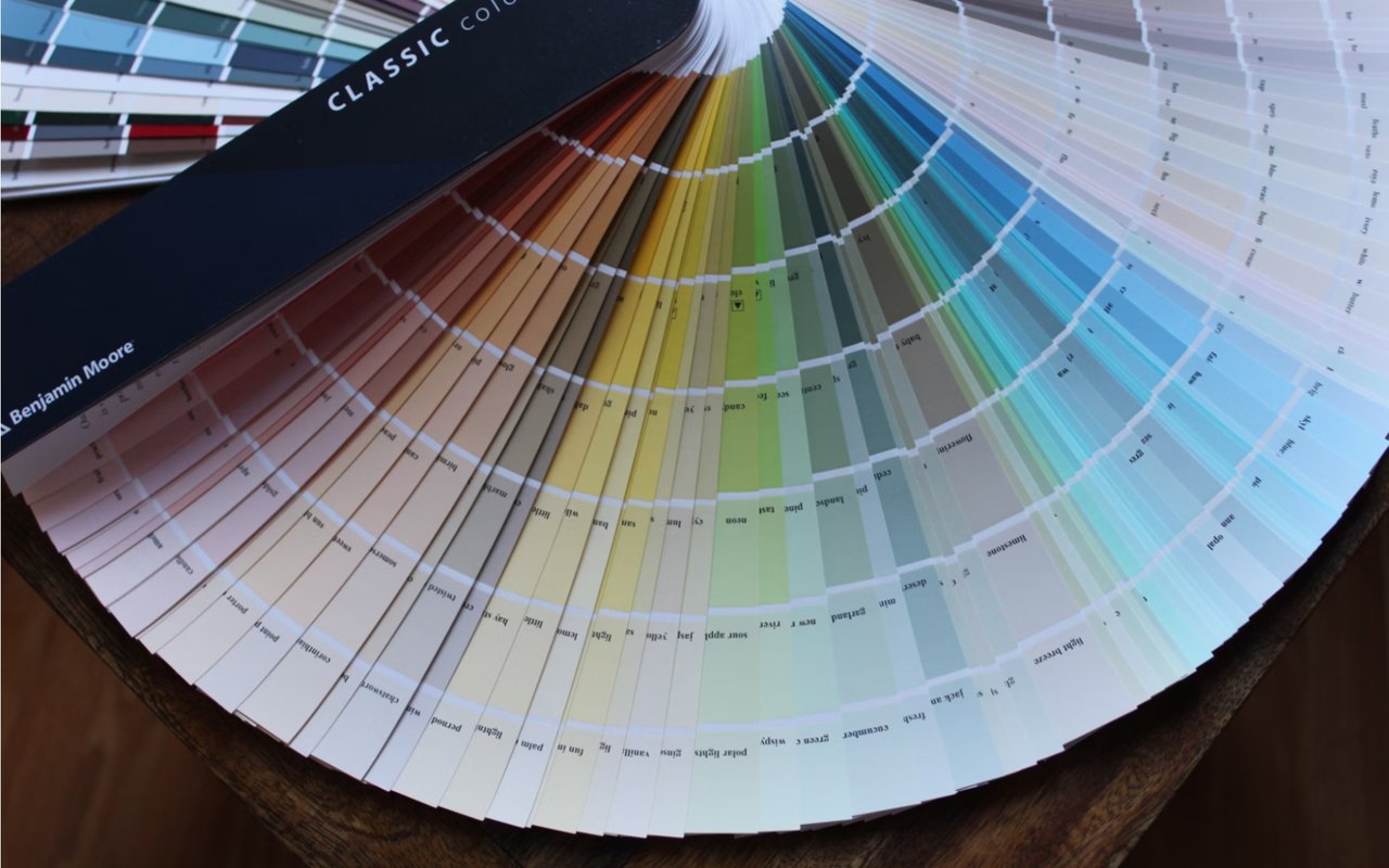
Understanding Undertones
Every paint color has an undertone, which is the subtle hue beneath the surface that influences how you perceive it. For example, gray might lean blue, green, or purple, depending on its undertone. Similarly, beige may carry hints of pink, yellow, or gray.
These undertones become especially important when coordinating with flooring, furniture, and countertops. If your hardwood floors have a warm red tint, pairing them with a beige that has pink undertones can amplify the effect, sometimes in an unintended way. Choosing a beige with subtle green undertones, however, creates balance and harmony.
Undertones are not always obvious on a paint chip. The best way to identify them is by comparing the color against a true white. Doing so reveals whether it leans warm, cool, or neutral. This step saves you from unexpected surprises once the paint is applied to your walls.
How To Use A Color Wheel For Your Home
The color wheel is a timeless tool for creating harmony in design. By understanding how colors relate to each other, you can build palettes that feel balanced and visually pleasing.
Complementary schemes use colors opposite each other on the wheel, such as blue and orange. This creates high contrast and energy, making a space feel dynamic. Analogous schemes use colors side by side, such as green, blue-green, and blue. This produces a soothing, unified effect.
For a modern approach, many designers use monochromatic schemes, which involve variations of a single color in different shades and tints. This technique works especially well in bedrooms or living rooms where you want a cohesive, calming atmosphere. Using the wheel as your guide gives you a framework for making decisions and prevents clashing combinations.
The Psychology Of Neutrals
Neutral tones are often seen as safe choices, but they are far from boring. White, beige, gray, and taupe each bring unique qualities to a space. White brightens and opens up a room, making it feel larger and cleaner. Beige adds warmth and softness, perfect for cozy living areas. Gray introduces sophistication, while taupe strikes a balance between warm and cool.
The advantage of neutrals lies in flexibility. They allow you to easily update your home with new furniture or accent colors without requiring a full repaint. Neutrals also create a backdrop for bolder design choices, whether through artwork, rugs, or decorative accessories.
If you prefer a timeless foundation with the freedom to change details over time, neutrals provide a dependable solution. When chosen thoughtfully, they elevate a room rather than fade into the background.
Bold Colors And Statement Walls
Bold colors add personality and drama to your home. A rich navy, deep emerald, or moody burgundy can transform a simple room into a striking statement. These tones work well in dining rooms, powder rooms, or offices where you want a sense of luxury or depth.
One way to embrace bold color without overwhelming a space is by creating an accent wall. This approach allows you to highlight architectural features, such as a fireplace wall or the space behind a bed. Pairing one bold wall with complementary neutral tones keeps the room balanced while still delivering impact.
If you decide to use bold tones throughout an entire room, pay attention to scale. Large rooms can handle deeper shades without feeling closed in, while smaller spaces may feel tight if every wall is painted in a dark tone. Testing samples on multiple walls will help you determine whether the effect feels right.
The Connection Between Color And Architecture
Paint tones should not be chosen in isolation; they should respect the architecture of your home. High ceilings, crown molding, and open floor plans all influence how color behaves.
In rooms with tall ceilings, darker tones can make the space feel more grounded, while lighter tones emphasize openness and airiness. Architectural details like trim and molding benefit from contrast. A crisp white trim against a colored wall highlights artistic details and creates definition.
Open floor plans require careful coordination because sightlines connect multiple spaces. Choosing tones within the same palette, or at least within the same undertone family, ensures flow and harmony. When color supports architectural design, the entire home feels cohesive and thoughtfully planned.
Creating Flow From Room To Room
A common challenge in home design is achieving consistency across multiple rooms. While each space can have its own personality, the overall palette should feel connected.
One way to create flow is by choosing a base neutral and repeating it throughout the home. Then, introduce accent colors in specific rooms to add variety. For example, a soft gray might serve as the foundation, while blues highlight the bedroom and greens accent the kitchen.
Another technique is to vary shades of the same color group. A living room painted in pale blue might transition into a dining area in deeper navy, maintaining unity while offering distinction. This layered approach allows your home to feel both cohesive and interesting.
How Furniture And Decor Influence Paint Choices
Your furniture, rugs, and artwork play a direct role in determining the best paint tones. A room with vibrant furniture may benefit from more subdued wall colors to prevent visual competition. Conversely, neutral furnishings often look best when paired with walls that provide a subtle pop of color.
Before painting, gather fabric swatches, wood samples, and photographs of your furnishings. Place them against paint samples to see how they interact. Doing this ensures the tones you select support your existing decor rather than clash with it.
Remember that paint is one of the easiest elements to change, while furniture and large decor pieces are often long-term investments. For this reason, many homeowners choose to build their paint palette around their most permanent features.
Bringing Color Science Into Your Home
Choosing paint tones is more than picking a favorite shade; it’s about leveraging the science of color to create an environment that enhances your life. By understanding psychology, light, undertones, and architectural context, you can transform every room into a space that feels intentional and inspiring.
Your home deserves to feel like a place you love every time you walk through the front door. Reach out to the Home Ready Team for trusted insight as you explore your options in Fullerton real estate.
Your home deserves to feel like a place you love every time you walk through the front door. Reach out to the Home Ready Team for trusted insight as you explore your options in Fullerton real estate.